Mockups
Now that a fair part of the underlying system is in place, Chris and I have been discussing the UI. We want the interface to be inviting to users and offer them something to keep them interested in the site while still providing the necessary services for NLP research. To accomplish this we believe we need to focus on the data we can present and also have easily located functionality for assisting the translational mechanisms.
Searching
On each of the screens below you will see a search box. Our current thinking is that we will have some knowledge of what language pair the user is currently interested in. We have discussed possibly using host names, like de-en.wikitrans.org, to indicate the choice. We might also display a list of available language pairs from the users language competancy settings. This particular piece is not completely solved, but we can assume a setting is in place for the sake of the interface.
The search box represents an article title search and the two buttons offer the user a way of telling us which language the title they’ve entered is in. From there I use the Wikipydia module to ask Wikipedia for more information about available articles. The Wikipedia API currently allows a user to say, “What languages do you have an article for Johns Hopkins University in?” and it returns a list. I discuss this more here.
What we do after fetching the article is not completely worked out yet either. For example, do we run an initial translation and present a machine translation to the user? Perhaps we show the article in sentence-split form and ask the user to translate the article from scratch? My gut tells me we’ll have a metric for our need on an article-by-article basis, perhaps combined with a user setting that will give us an answer.
The article landing page
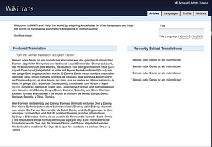
The first page a user sees is loosely called the articles landing page. It is likely this will become the first page a user sees when visiting the site. There is much to be gained from using a presentation similar to Wikipedia’s Main_Page layout. For example, replacing “Today’s featured article” with “Today’s featured translation” and “In the news” with “Recent translations” would cover most of our needs for a landing page. That might look like the screen below.
From-scratch translations
We also have two other major concerns about the UI. First, we want to easily facilitate from-scratch translations on a sentence-by-sentence level. My intuition tells me this simply involves a list of sentences and then a field for entering them. A mock-up for this looks like below.
Interestingly, I have found the tools for sentence splitting somewhat lacking and also somewhat diverse.
Correcting translations
It seems important that correcting translation be done with an easy system. We think it’d be ideal to click the sentence you’re interested in and have a box pop up allowing a user to type in a corrected sentence. The mockup only shows an input box, but the real version would probably display the original sentence, an input box and then a submit button.
Handling the translated sentences and their relation to translated articles will be done in a variable way. We want to allow the translated articles to be built from the best translated sentences we have, but determining the best translated sentence is not totally straight-forward. For now, we will track all of the sentences and probably just display the latest translated sentence in a sequence of sentences representing the translated article. Mock-up below.


